In a landscape dominated by bold and high-impact expressions, Dream Beauty imagined a quieter, more inward ritual of beauty. Product formulations prioritise breathability, lightness, and ease. This is expressed through a brand and digital experience that feels soft, youthful, and quietly ethereal.
CLIENT
Dream beauty
PROJECT
Brand Strategy | Brand Communication
| Web experience | Brand Guidelines
The Dream Beauty brief imagined a world where makeup feels intentional, gentle, and deeply personal. Moving away from the performative nature of contemporary beauty, the brand focuses on everyday makeup that is soft, breathable, and designed to enhance rather than transform.
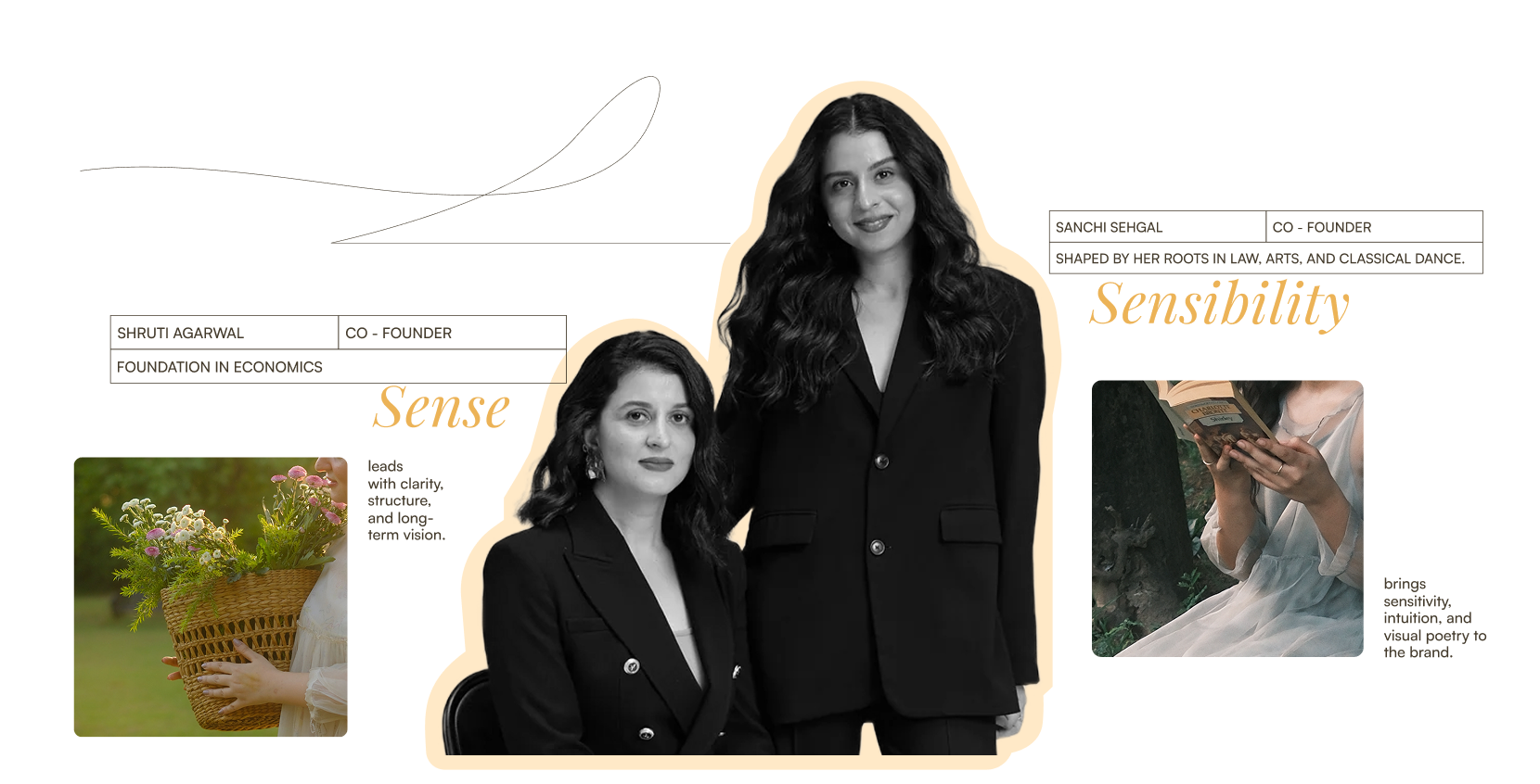
Celestial cues were chosen as a visual anchor to express lightness, calm, and the universality of makeup as a daily routine. Their timeless quality allows the brand to feel aspirational without becoming intimidating. This was an important consideration as the brand was also accounting for younger users and those just beginning to explore makeup. Conversations with the founders and early users revealed how makeup functions in everyday life: as ritual, as expression, and as a small act of creativity. These insights shaped the brand’s emotional core — thoughtful self-expression, ease, and subtle confidence.
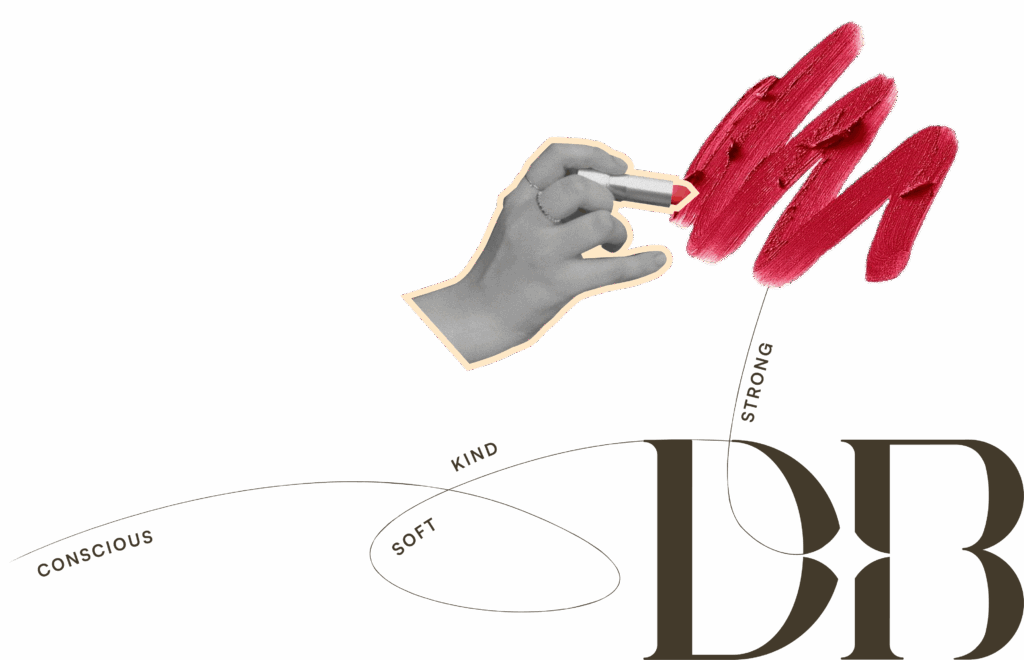
The brand identity brings this vision to life through a calm, luminous aesthetic that creates space for a more conscious relationship with beauty. Visually, this translates into airy tones, soft gradients, and an understated glow that feels light, approachable, and contemporary.
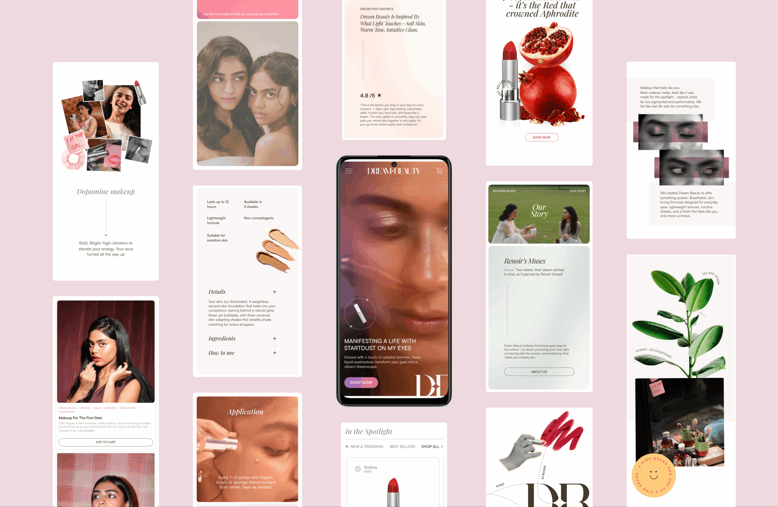
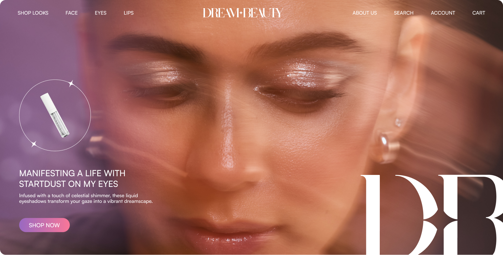
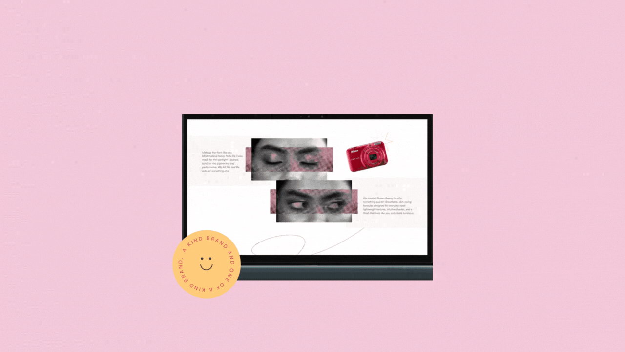
The website became the centerpiece of the brand experience. Spacious layouts, considered pacing, and light-filled compositions allow products to exist naturally within the shop, reducing cognitive load while enhancing product focus. The overall tone is friendly and reflective, making the site feel less like a traditional storefront and more like a visual journal.
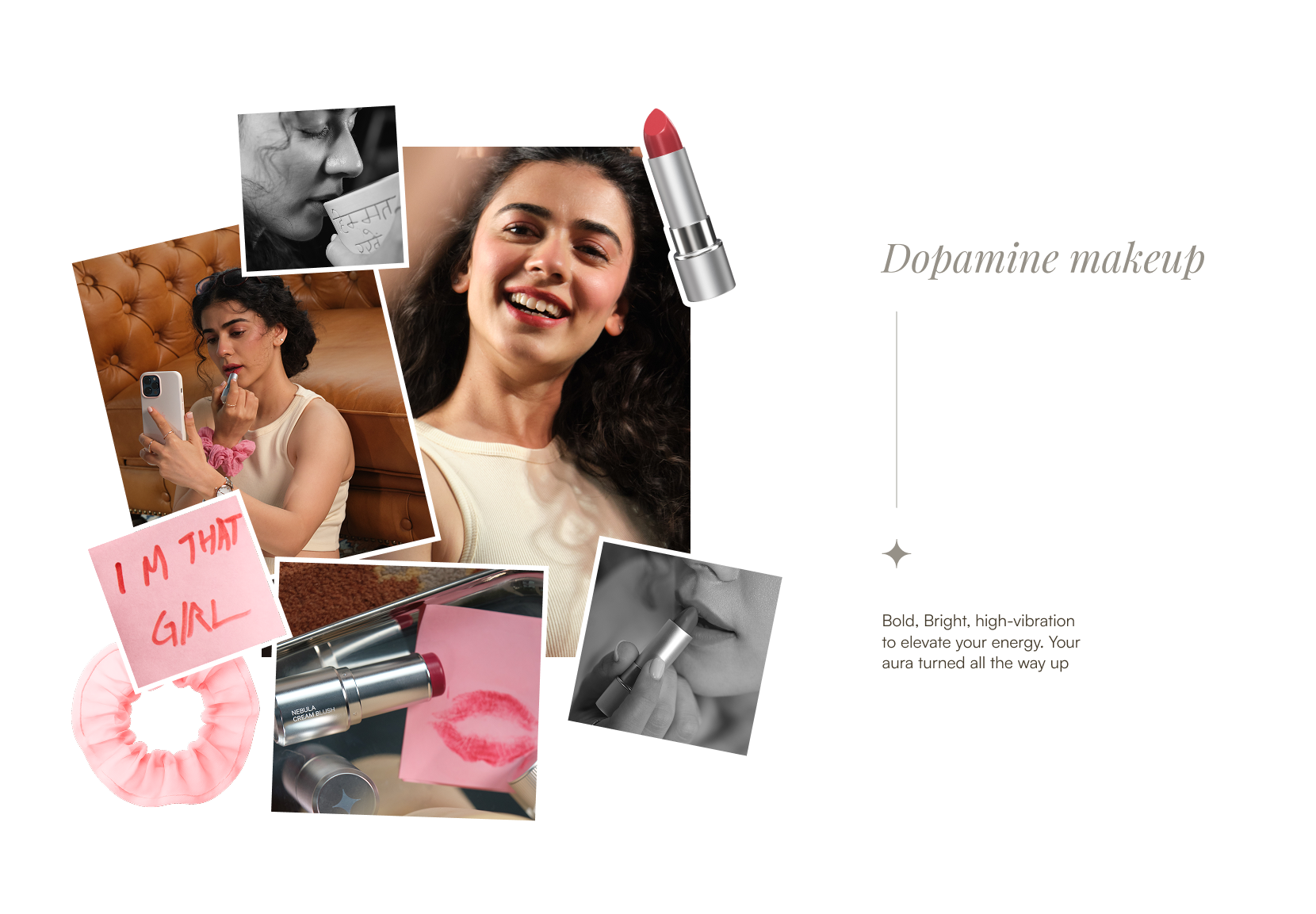
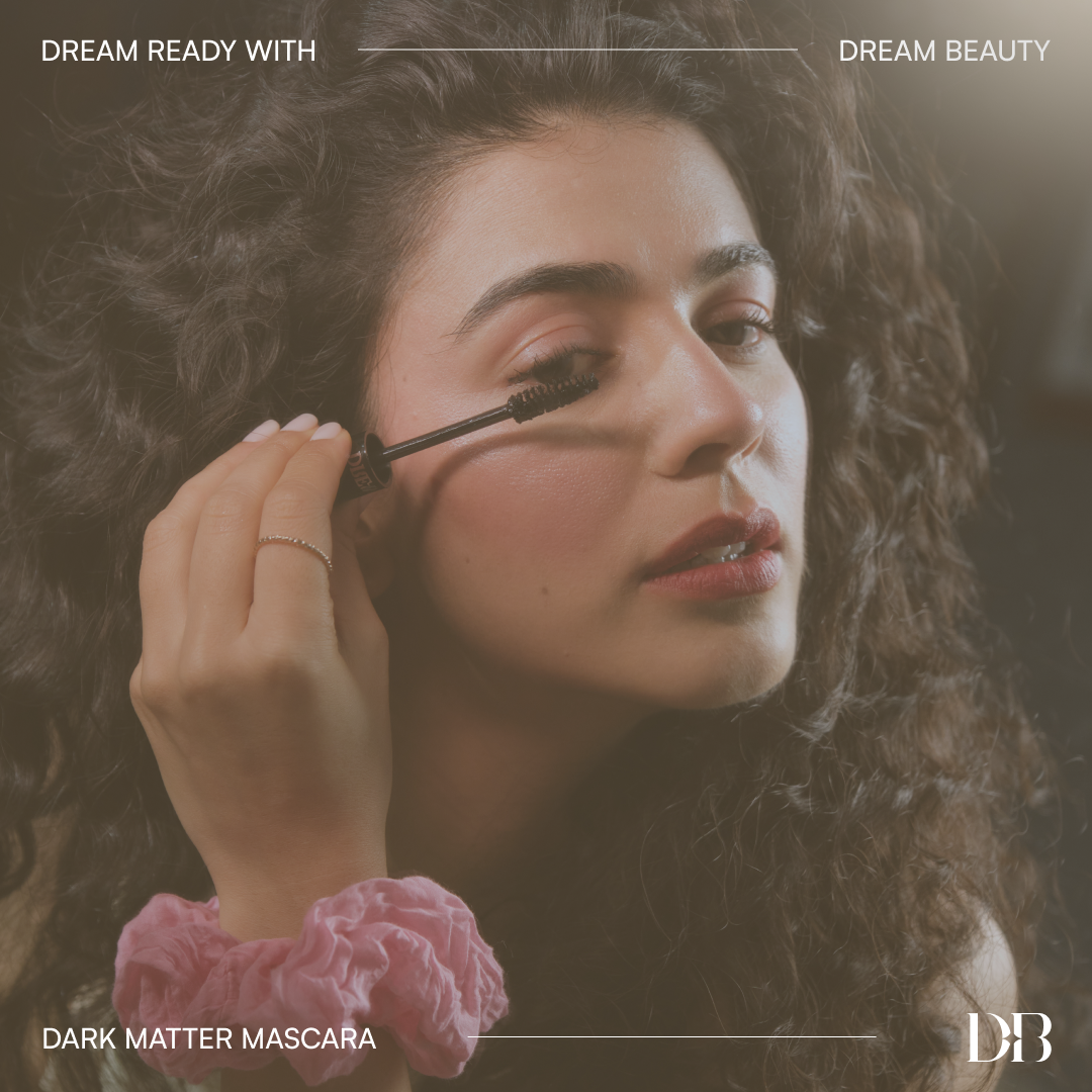
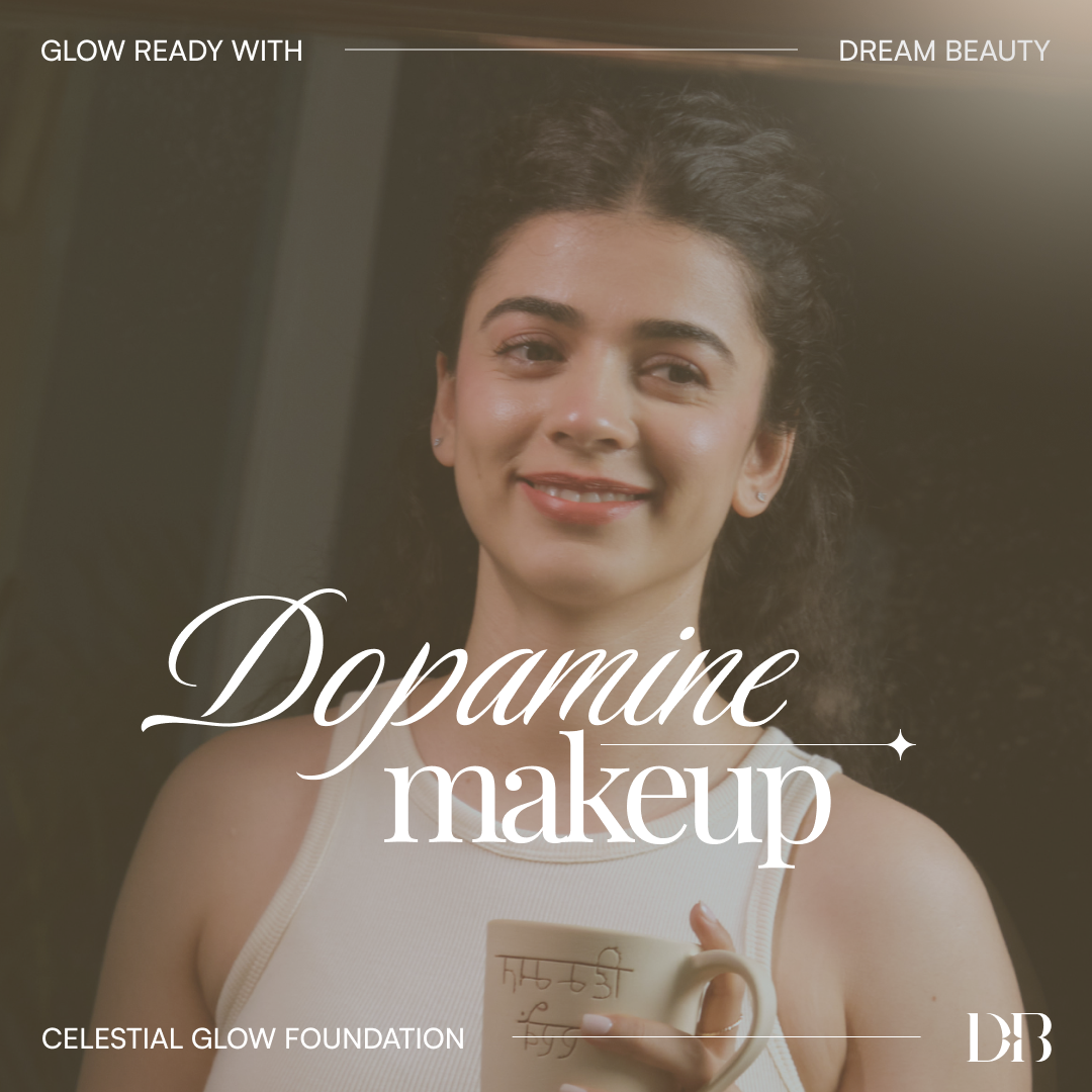
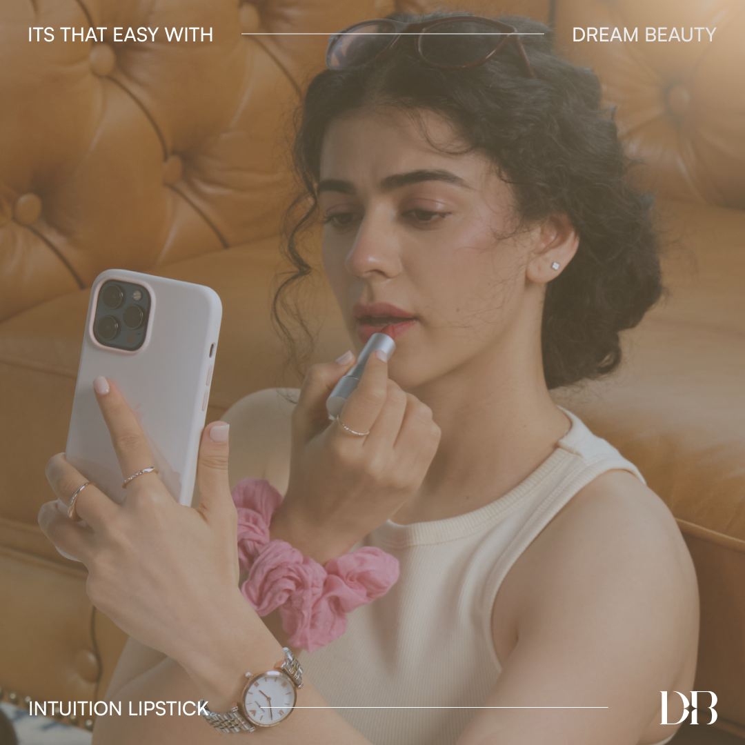
Across all communication, Dream Beauty adopts a warm, reliable, and non-judgmental voice that emphasizes positivity and empathy. Alongside the website, a suite of digital assets and social templates extends this sensibility across platforms. Soft glows, diffused color, and balanced typographic pairings maintain the brand’s gentle, celestial aesthetic while allowing room to evolve across campaigns and product stories.
At the mirror, makeup turns into a pause for reflection. That softness shaped a brand world that feels personal and quietly luminous.
_
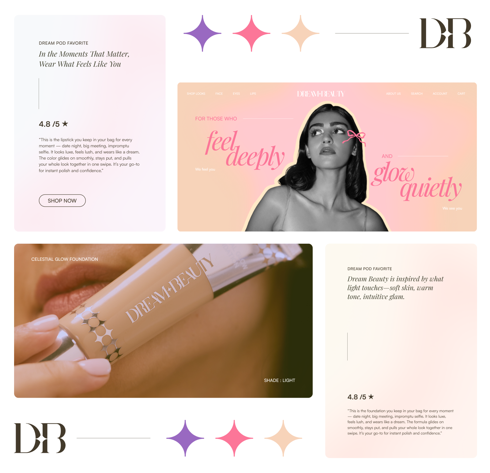
Soft gradients and an elegant palette set the tone, complemented by a typeface that feels modern yet gentle.

With a fluid grid system and soft highlights and, the website feels less like a storefront and more like a personal beauty journal.